With kinder weather, Neil Mackay finally made it out of the Welsh hills. Our staff enjoyed Neil’s open, receptive and engaging style and although we didn’t always agree, we enjoyed the dialogue.
The single most important reflective from Neil’s visit is that, as a school, we can make whole school adaptations that will benefit all learners and make reasonable adjustments our practice for key students precisely. That these adjustments, may benefit a broader range of students that we realise, certainly support students with learning with dyslexia, dyspraxia, dyscalculia, ADHD, Asperger syndrome, Tourette’s Syndrome, OCD, anxiety disorders and others.
Some very practical improvements for all students.
Paper should be thick enough to prevent the other side showing through. Matt rather than glossy.
Use cream or a soft pastels coloured paper, backgrounds. Some dyslexic people will have their own colour preference. Coloured poly-pockets.
Avoid green and red/orange/pink back grounds as these are difficult for colour-blind individuals.
Evenly spaced sans serif fonts, Verdana or Arial.
Avoid underlining and italics; use bold instead.
AVOID TEXT IN BLOCK CAPITALS: this is much harder to read.
Boxes and borders can be used for effective emphasis.
Use left-justified with ragged right edge. Avoid narrow columns or cramped text (as used in newspapers). Line spacing of 1.5 is preferable. Bullet points and numbering is preferable than continuous prose.
- Use short, simple sentences in a direct style.
- Active rather than passive voice.
- Avoid double negatives.
Flow charts are ideal for explaining procedures. Pictograms and graphics help to locate information.
Provide a glossary.
For long documents include a contents page at the beginning and an index at end.
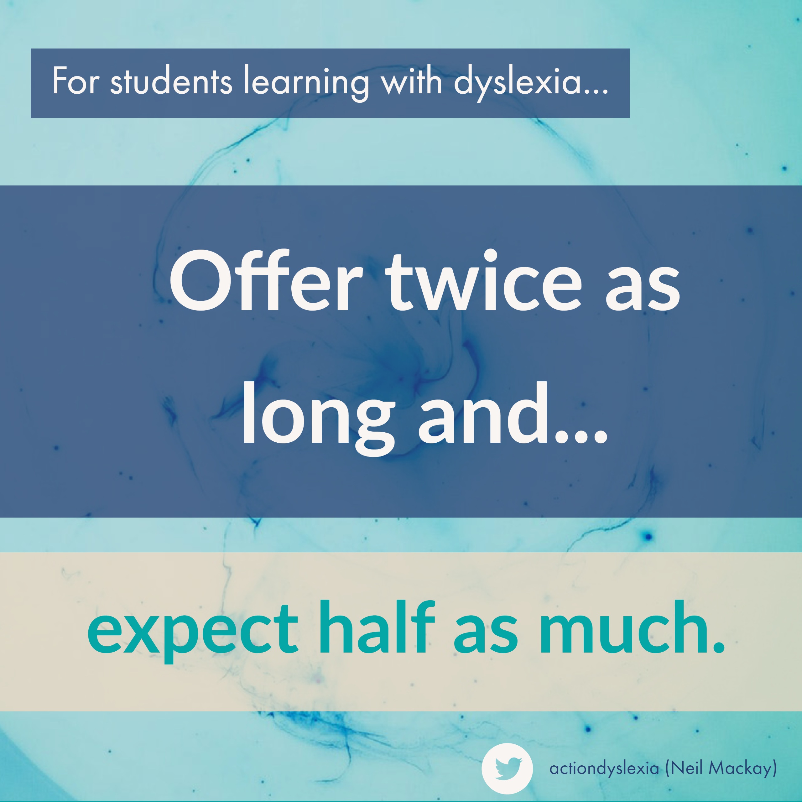
For students with slow processing or learning with dyslexia, offer these students
…twice as long and expect half as much. Neil Mackay
Now, to be clear, I am not saying we expect less from students learning with dyslexia for example. I am saying that fair is not equal.


