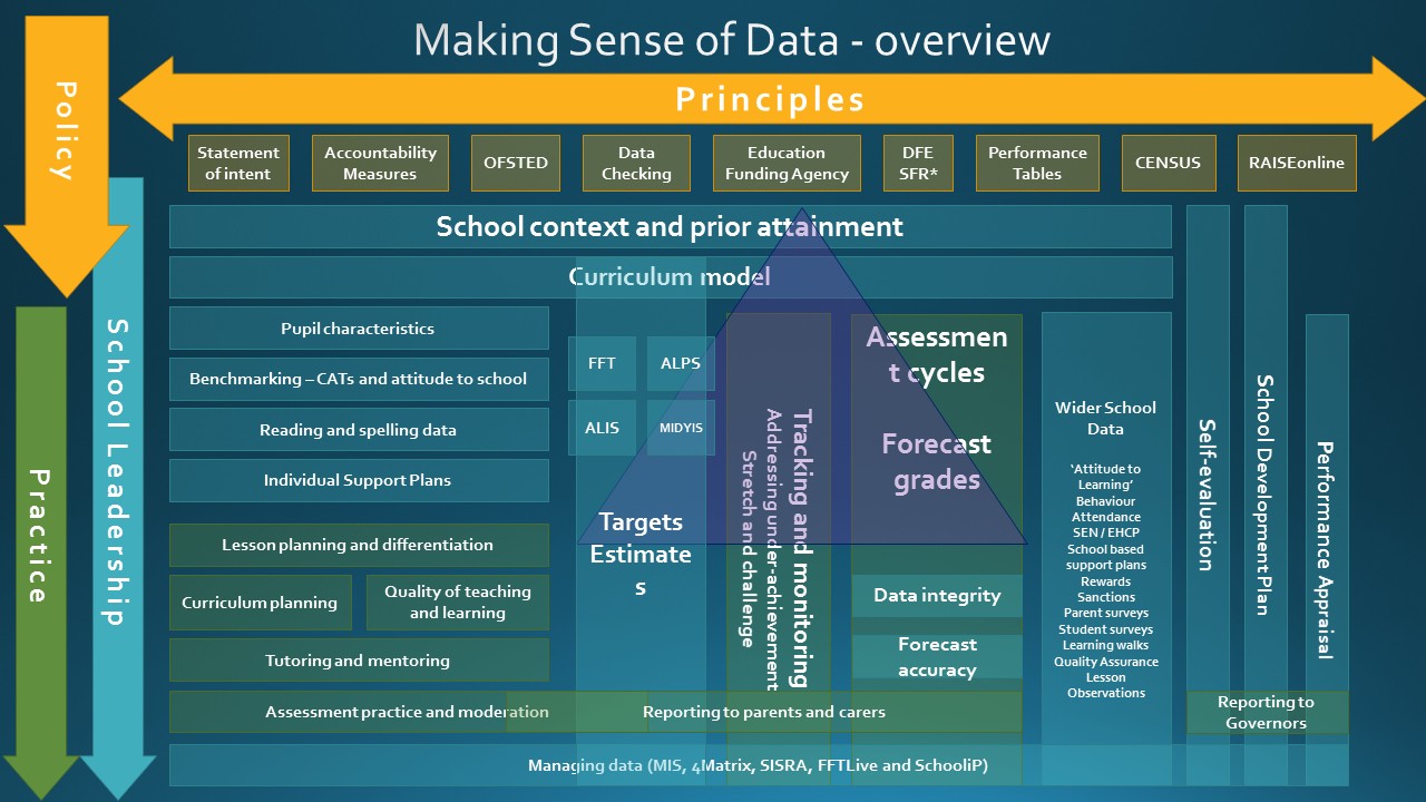
In preparation for the ASCL Workshop I revisited a visual diagram of leading data I have been building, rebulding and adding to as I work with the data team at The Wellington Academy. This is where I am at currently.
It is an animated slide that maps the school principles, government policy, leadership and practice. Any thoughts?
It is the first slide of the short presentation I gave to ASCL delegate attending a workshop entitles “New to Leading Data.”
[qr_code_display]


