Today, we ran a mini trial of Exit Ticket (ET). A catalytic hot bed of learner activity and more importantly instant feedback. Feedback to the students and to the teacher.
Connect with the learning in your classroom, instantly.
– that is my cheesy kicker, not their polished branding.
Setting up an account was straight forward, writing a quiz and connecting with students, all pretty straight forward. It went something like this.
Signed up.
New ticket and selected “quiz.” Framed the quiz, set a timer (it keeps the quiz moving along), choose not to reveal the correct answer but whether or not the student got it correct, showed the overall result and randomised the question order.
I ignored “standards” – it is an American education reference and moved onto the questions.
The questions were copied in from a Macbeth Powerpoint. Simple. Tagged, labelled “easy, medium or difficult,” with the multiple choice options randomised. I stuck with four answers. (I do wish these quiz engines would allow more than one correct answer.) I stuck with multiple choice questions, rather than True / False and the Free response, although I am keen to explore the latter. A great way to gather, compare and discuss student opinions and interpretations for sure. Question order was a drag and drop affair, easily editable. The six question quiz meant that I was ready for the participants.
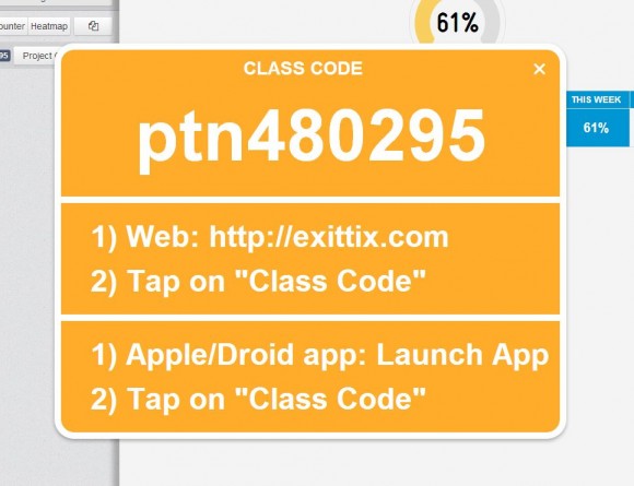
A simple but clever projector view prepare the visual display and prompts the students. Students connect to the quiz via a code that can be displayed via the “project class code.”
The double “tt” in the middle of the exittix URL caught a few students out. One to be aware of.
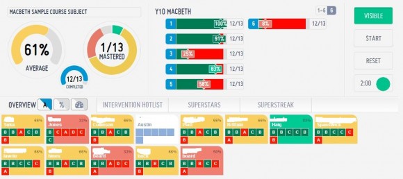
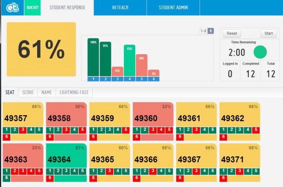
Finally – make the quiz visible and as the student “join” the quiz, the dashboard comes to life with student tiles. Here a veritable feast of catalytics will be displayed. Live, as the students attempt the quiz but only once you have controlled the start. Neatly managed with a screen and projector toggle selector (including class code, standby, scoreboard, student counters, heatmap and reteach).
So, you see
Answers, correct / incorrect by student, colour banding (grey for non-starter), completed, question proficiency and how students answered, answer time, mean scores. Sortable by name, score and response time. Then there are instant intervention and superstar lists.
Meantime students see an anonymised, engaging display.
A re-teach section – with who needs a little more support. Again, information that can be shared with students. 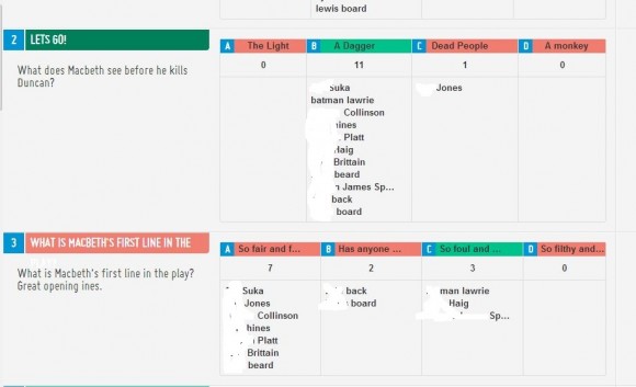
Did I mention this is accessible in real time?
There is student admin, to manage the students and create groups (currently a free feature) and a score card to track progress.
Now all of this is great as long as the students can access the quiz. Sadly ET did not play nicely with IE over our network. We moved over to student phones. The twelve iOS competitors really engaged with the quiz, the remaining students were left on the sidelines, disappointed.
Just so you know, the additional features are add-ons – free until Feb. 9th 2014 Configure apps.
ET is probably the simplest and there best catalytic tool I have explored so far. The only health warning – can it play nicely with IE?
[qr_code_display]
After posting I tweeted ET. Their response is that they recommend all browsers except… the one most schools use? So apps it is.

