What percentage of outstanding schools have below average ability intake?
It is a good question, isn’t it. What percentage of Outstanding schools have below average ability intake? Without the limitation of 140 characters “What percentage of Ofsted Outstanding rated schools have a below average intake?” If you follow the link through to the tweet, you will see Paul’s Ainsworth additional tweet adds further gradation to Liam Collins (@kalinski) initial enquiry. It was clear from the RTs and interest in the conversation, a number of school leaders had pondered this data ladened question. Is there an easy way to check..?
Time to analyse performance beyond that of their own schools performance for many senior leaders is rare. If they do, it is usually to comparison school performance to national benchmarks, achievement, progress and gaps, possibly to explore SFR releases. But Liam’s question is one that many Headteachers, Principals and aspirant school leaders would have asked themselves, especially those working in challenging circumstances, with a below average intake. It was a question that peaked my interest and luckily for me, I knew exactly who, would know how, to find the answer, Phil Bourne (Director for School and Academy Compliance).
A quick email seeking Phil’s support has ended up being the catalyst for this investigation. We have interrogated the data, challenged each other and consulted our peer groups in our respective education settings. We hope that the report which we have co-written encourages discussion about some of the key tools in our education system. These tools are used to drive up standards but are also used to define the experience of our schools, staff and pupils.
In a week where the topic Performance Tables filled most of the education headlines, the broader question about whether data can actually inform us about how our schools perform is a poignant one. Outcomes from assessment are an important mechanism for differentiating between schools and pupil performance. Even with the ‘removal of levels’ the likelihood is that there will not be less assessment but substantially more. This assessment will be combined to make judgements of schools and will play a role in the toolkit that Ofsted has to make judgements on achievement and ultimately Overall effectiveness. Whatever assessment tools are used, they are designed to differentiate and half of the system will only ever be above average.
“What percentage of Ofsted Outstanding rated schools have a below average intake?”
To do this is simple enough, with access to the schooldata.org.uk portal, that is. Schooldata was a six-month project which enables school leaders to compare any public school performance measure, Ofsted data or school variable that has been shared by the nationally available datasets. Bringing together information helps us to ask and answer questions about the education system and make comparisons between data sets.
Step 1 – Group schools by the selected Ofsted rating and compare these schools to all other maintained schools in England. (This data has been taken from the 31st December Ofsted management information data release).
Step 2 – On the vertical axis show the proportion of pupils in each school attaining a particular performance measure.
- Primary Schools – attaining Level 4B or above in Reading, Writing and Mathematics combined (the metric commonly used to recognise pupils are Secondary School ready) from the 2014 KS2 performance tables.
- Secondary School – 5+A*-C including GCSE English and mathematics. The headline measure.
- Best 8 Capped Grade converted to a point score.
Step 3 – On the horizontal axis, the prior attainment averages for each school.
Red dots represent schools with the selected Ofsted judgement. Blue dots represent all other schools. Lastly, the mean performance measure value, is marked on the chart by the grey line.
Key Stage1 APS and Secondary ready (L4B+ R/W/M)
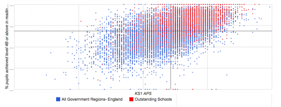
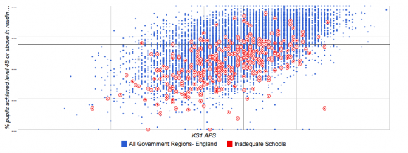
Key Stage 2 APS and % attaining 5+ A*-C including GCSE English and Mathematics
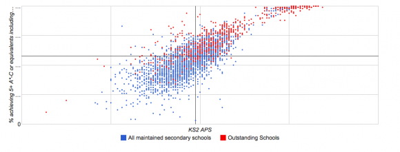
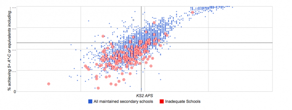
What can this analysis tells us about social disadvantage? We need to consider, with an appropriate eye, the impact that prior attainment has on both the outcomes of pupils and the evaluative judgements made by Ofsted about the overall effectiveness of these schools. Whether the evaluative mechanisms for assessing the outcomes of schools that have the greatest proportion of able pupils is sufficiently taxing. Certainly, the move to a broader and more progress focused measures, albeit competitive measures, should be welcomed.
@SGorard‘s FSM analysis: https://www.dur.ac.uk/resources/education/Pupilpremiumgap.pdf …, ‘we cannot expect same results from schools with more permanently poor pupils’.
The New Accountability Framework
We recognise that as a prerequisite for the highest Ofsted judgement requires a commitment to progress and attainment and that the link between Ofsted overall effectiveness grades and achievement is published and transparent, and yet our investigations and discussion leave us to question whether or not our current systems provide a level playing field for all schools.
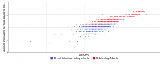
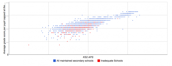
Statistically, the scatterplots highlight that both Primary and Secondary schools with pupils with higher prior attainment profile, have a greater likelihood of getting better achievement outcomes and now as we observe their Ofsted Outstanding judgement. The converse is equally presented. This is particularly important if we are to look at school effectiveness. Whilst progress doesn’t represent the best way of recognising achievement for all pupils it is a more representative, possibly fairer, measure. If we consider the meaning of achievement, it is and potentially should be when comparing school effectiveness be synonymous with progress. This is arguably fairer.
The current metrics did not fully recognise this, ie. the capping of Progress being met at a B grade or above or level 5 for attainment at the end of KS2 inspite of prior attainment or the proportion of students attaining threshold measures 5+ A*-C including GCSE English and mathematics.
The new Progress 8 measure will help to further differentiate those schools with pupils with higher prior attainment profiles but the Attainment 8 measure will always challenge those schools with the lowest prior attainment profile. The most effective and agile of these schools will embrace the challenge but may not succeed in attaining the highest outcomes given their starting point. Should we accept a system that regularly embraces reform and change that therefore such limiting judgements, ironically, are also an area that require improvement?
To help visualise this perspective the Best 8 Capped Score against KS2 Prior Attainment average highlights a familiar pattern when filtering for Ofsted Outstanding and Inadequate judgements.
Key Stage 2 APS and % attaining Capped Best 8 grade converted to a point score
All schools, regardless of their starting point, have a responsibility to do their utmost to secure the very best outcomes for each pupil in their school. However, to address the balance of the observations that have been made, is it not right that judgements of effectiveness (and indeed achievement) give appropriate consideration to the attainment profiles of every school.
This analysis would underwrite the current reforms, and stress even further the need to recognise the value schools add to pupils starting points. It is recognised that Ofsted have allowed schools to opt in early for inspections based on these judgements too. For the system to make real strides, there needs to be a step-change, rather than a step-up. Attainment outcomes are an important factor, but not the only factor in making judgements about schools. Curriculum provision and destination measures are certainly two good examples. We can only hope that one day there might be consensus.
Table 1: Distribution of Ofsted judgements for schools that have below average prior attainment.
It is encouraging to note that the proportion of schools that are good are almost equal in relation to their starting points. Wouldn’t it be powerful if a fairer proportion of schools with the lowest prior attainment profile were judged to be Outstanding? This parity would have a significant benefit for the pupils, for the communities that they serve and the resilient teachers and staff that work in them? Next, to look at the comparison to the national distribution of Ofsted grades.
Table 2: The national distribution of Ofsted grades
The data speaks for itself.
We know data can not provide all of the answers, however, it has certainly generated many, many more questions for us to explore. Questions to challenge and support the system, the policy makers, the Watchmen and school leaders. With open data, we are better able to ask these questions and are grateful that this data is publicly available so that the system can form its own views on its fairness.
This post was written in response to a community call to action and we hope that these insights will provoke both discussion and debate. My thanks to Phil Bourne, for a very worthwhile investigation and great professional development.
Phil is the Director for School and Academy Compliance but is probably most famous for supporting thousands of schools with the Data Enabler programme, online Educational Outcomes work and the National Challenge Venn tool that he developed when he led the performance data programme for the Specialist Schools and Academies Trust. He has a broad range of experience in working with schools, professional bodies and academics. This work, whilst being largely technology driven always remains people centric has contributed towards improving educational outcomes for young people. Phil has developed an online portal which allows groups of schools and academies to be compared using publicly available data and also supports groups who are working to improve knowledge, information and deliver better outcomes. @philbourne77 (https://www.schooldata.org.uk)
[qr_code_display]


There is a lot to take in here and I may have missed some or all of it! However a question that comes to mind is the issue of prior attainment (labeling) affecting future performance. It would appear that poor performance in primary schools tends to follow pupils into secondary schools. Also, is there any data that would help to see if transferring from a poor performing primary to a high performing secondary with poor prior performance improves future pupil performance? Further, what is the geographic distribution and links between the “pairs” of primary and secondary schools (the schools where the majority of a primary school cohort transfer to the same secondary school) in relations to social/economic factors? More questions, is there a “bleed” from poor performing primary schools of their more able pupils into better performing secondary schools thus sustaining the better performing secondary schools? What is the landscape in terms of attracting higher performing pupils into secondary schools in relation to the schools within an area? For example if there are 8 secondary schools serving a population, and given national averages, if two of the secondary schools achieve a headline figure of 95% what affect does this have on the remaining secondary schools?
I will get back to your reply. As soon as I get time to come up for air.
Pingback: Education Policy : Surely it’s time to put on some clothes ? | Disappointed Idealist
Interesting parallels can be found in special school data taking similar types of school and plotting OFSTED results against per pupil funding.
I am a governor who looks at the data from our small primary. Looking at these graphs I was expecting to see inadequate schools falling below the regression line. This doesn’t really seem to be the case. Which suggests value add not a big factor in inspection. Or some of the data inaccurate (anything internal without good moderation for instance – is there evidence this is a problem for example in stand alone infant schools?)
Can I confirm your use of regression? The data is drawn from the national data sets.
This type of analysis can not be applied for a single investigation, as in a stand alone school, however you could explore the environment picture of inspection judgement for the school in that context.
Pingback: Is there a ‘cargo cult’ approach to school improvement? | Evidence into practice