 We are in the process of preparing all the schools data ready for analysis. It is not a glib comment. We really are setting up from a meagre starting point. Burning the candle at both ends. We are in the process of creating our focus groups or filters. Next on my list was Upper, Middle and Lower Bands, or UML bands. My first job to clearly explain how the bands were calculated.
From 2011, (I hope that is right) the KS2 prior attainment report was amended to use fine points and teacher assessments for students without test results. This methodology, in turn, reflecting the changes in the methodology used to calculate average points score for Value Added and expected progress reports. A lot more important in the current climate.
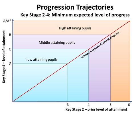
An additional report shows the percentage of students split into three bands, low, middle and high, based on their prior attainment bands. These groupings feature later in the Raiseonline, based on attainment and progress measures.
Students are placed is these bands based on the following calculations.
| Prior attainment band | KS1 prior attainment | KS 2 prior attainment
(fine points) |
| Low | Average points < 12 | Average points < 24 |
| Middle | 12 <= Average points < 18 | 24 <= Average points < 30 |
| High | 18 <= Average points | 30 <= Average points |
Please don’t read anything into the association of Shrek and my colleagues. It was just the images search for “upper, middle and lower bands” was a little scant. Shrek at least offered an ‘aha’ expression.
[qr_code_display]


And to make things even easier for staff to understand it roughly works out at an average of:
Lower = Level 3 or below
Middle = Level 4
Higher = Level 5
Indeed it does Dan.