Moodle resources are rarely inspirational. Barely inspirational, if anything, resources and standard files are frequently uploaded to fill course space.
You said we needed to add content, I added content.
As a result, resources are rarely discussed in Moodle conversation but just accepted expected to be there somewhere. So, I challenged myself to brighten and repurpose web pages in my teaching. Webpages are so much more versatile that a WORD document for example. Copy the text from an office document (CTRL+C), paste it into the browser search bar (CTLR+V – removes all unwanted code), then copy it again (CTRL+A) before pasting into the webpage (CTLR+V again). Add formatting and job done. The most useful point, with resources, is that if there is an typo, or the content changes, or needs revising, you are just one click away from an update.
So here are my suggestions.
1 Add a splash of colour. Upload a icon pack to your course(s) and regularly use colourful icons to direct student activities. Highlighters, folders, pens, notebooks or group work activity icons.
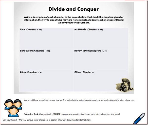
2 Think big. For this webpage idea I created a slide in Powerpoint, exported it as a Jpeg. Uploaded it to Moodle and added it to my webpage. The resource was both the stimulus for the lesson and the lesson plan.
With the class separated into groups, Alex, Mr Mackie and so on, the webpage was projected onto the whiteboard. As students worked through the task, uncovering key facts from the book, they wrote their answers directly on the the projected image. Some students, even acted out “being the teacher,” which showed me they were enjoying their given role. When the task was completed conquered students transferred the notes to their workbooks. Who said said old school teaching is dead?
I did learn that the extension activities perhaps need to be moved to the top of the page, but as its a webpage, that is a quick fix. Finally, the helmet icon proved a great puzzler. Only two students managed to make the connection between icon and task title, despite many trying, and in do so, earnt a Merit point. So, maybe webpages are Moodle’s ugly duckling.
Since writing this post, I have changed the image and text over, I think that works better.


