Our investigations with Quick Key mobile app scanning continues. Our confidence in the app is growing, our site licence fee paid. We will soon be ready to collaborate. Quick Key enhancements ideas are coming forward and our question design discussions are taxing and stimulating in equal measure.
In the previous post I mentioned that we going to investigate “how small, too small was.” The results are in. The default Quick Ticket prints two per sheet – what I am referring to as 100%. Today with copied (enhanced the darkness +3) and reduced the Quick Ticket to 70%, 40% and 30% ready for testing. Test A – scanability* and Test B pupil use.
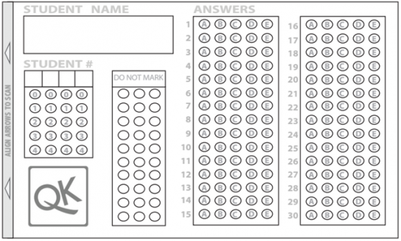
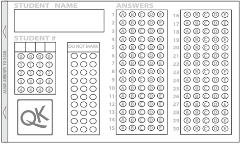
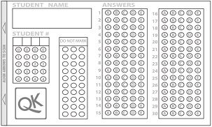
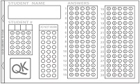
We envisaged an A6 ticket would still be useable for pupils and small enough to staple / stick into exercise books. We started with 70%, it fit inside the scan lines (why wouldn’t it?), it scanned perfectly (why wouldn’t it?). At 70% the lozenges were smaller, but not too small. Which left me thinking… how small? How much space can we leave for the all important questions. So we skipped 60% and 50% and went for 45% and 30%.
Test A – all the tickets scanned (why wouldn’t they?). Most importantly, once the tickets were reduced beyond 50%, the height the camera needed to be from the ticket reduced significantly. This had two additional benefits. First, camera adjustments were more precise and more importantly it meant we were able to rest our elbows on the table – adding real stability. With one the elbow firmly planted on the table, we were able to feed new tickets under the camera. Scan, scan, scan. At 30%, completing the Quick Ticket itself was starting to get a little tricky.
PS – natural light from very large windows seemed to impact our scan success rate. Simply drawing the curtains helped.
This evening, when I asked about the response/answer sheets – I was reliably informed that it was high of the Quick Key wish list. It is currently in colour, bright green, light green and red. We have mentioned the green-red colour issues, suggesting blue/yellow would be a better combination. But seeing as we spent a lot of time at the photocopier today, we thought that black and white printing might mean that Quick Key need to offer bright green fill, green circle or no fill, and a hashed green circle. That way, the answer sheet would work in black and white too.
In the meantime, we/I are working on a A5 30 Quiz (Q&A) and Quick Ticket sheet – the “all-in-on.” Given space for 30 questions and 150 answers is tight, it is no easy task. Half-term is reserved for complex processing and logic questions.
Scanability* – a made up word but absolutely the right word.
[qr_code_display]
