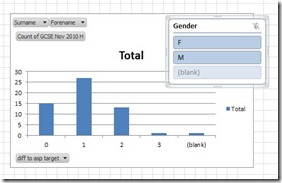
12 months ago I was shown pivot tables in Excel 2007. I was very impressed but I think I only had one real purpose to use them, when analysing ICT OCR National results. In all honesty, with just 4 grades (D, M, P, Working Towards WT), a fantastic ‘shared’ grades database written by a colleague, I ended up using Filters and COUNTIFs.
Now, working with the English Department, a much broader grading scale, coursework and exam grades, and individual question score reports I am back with Pivot Tables and first impressions, there have been some significant improvement to pivot tables in EXCEL 2010 and some useful new features, “Sparklines” and “Slicer(s).”
 Everyone is under pressure to prepare the analysis and act upon it, to give every students the best opportunity to reach their potential. Pivot Tables enables me not only to analyse the data but to change the visual display of the data by which ever variable required at the click of a SLICE. In my example, typically by grade, gender, coursework grade, or class.
[qr_code_display]
